Tags
This gallery contains 7 photos.
I’m skipping a few shoots and going on to my favorites from my first appointment at the SMP shoot on …

11 Thursday Jun 2015
Posted in Art, being Facebook friendly, photo
Tags
This gallery contains 7 photos.
I’m skipping a few shoots and going on to my favorites from my first appointment at the SMP shoot on …
10 Wednesday Jun 2015
Posted in Art, being Facebook friendly, photo
Some nights I sleep soundly and others I sleep for a few hours then get up to go pee only to find my dog has taken my space in the bed. I try to get back to sleep but my brain is already working on other stuff.
Well tonight is one of those nights. So I decided I should work on some of my images. I have eight photo shoots to go through. All ready for me to pick my favorites but I don’t quite feel ready to give my full attention to hundreds of images. So instead I chose one and decided to make something of it.
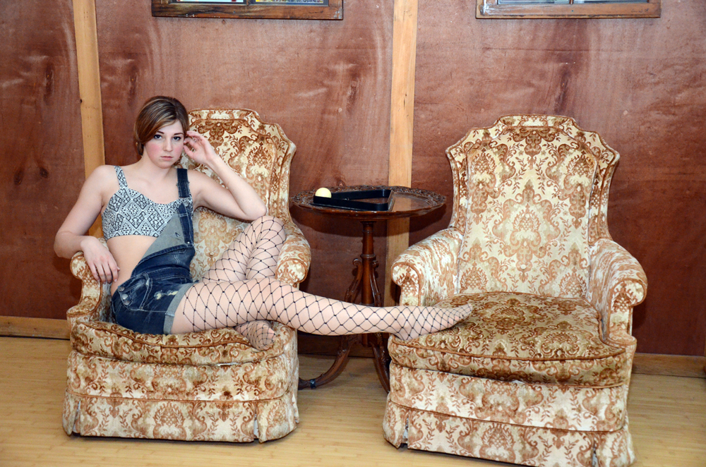 20150606 Sandra R Set 04 Image 01
I like the pose here with Sandra R’s leg spanning the two chairs. It’s like she is claiming both chairs. She is purposely not inviting you to sit down. It’s a good story in the composition (at least from my perspective).
Everything looks so bright and shiny I felt that I needed to rough it up a little or a lot.
The first thing I did create couple of adjustment layers to mess with the colors. Once I got a vintage looking color scheme I then went on to simulate physical damage to the photograph. I used a Black and white picture of metal scratches. The scratches are only there to be a template for the damaged to the image. I used the color picker to select the scratch pattern. then used it on a layer mask of the original image. I cut away the pixels in the selection effectively cutting away (masking) parts of the image. I then painted back some of the lost details using the layer mask.
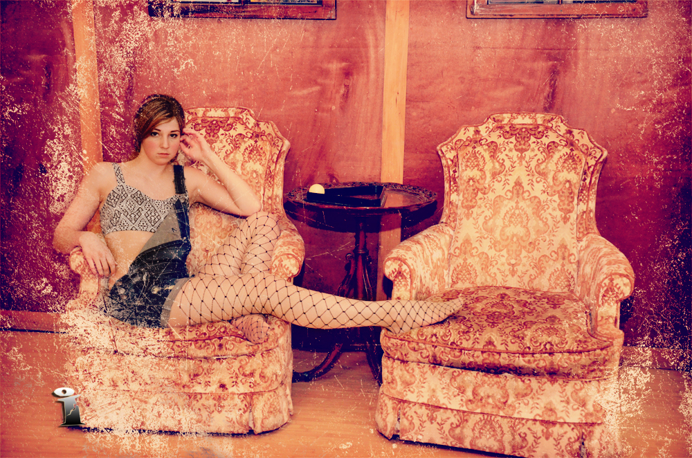 20150606 Sandra R Set 04 Image 01 – Old Pool hall
I added a crumpled paper texture under the image so that it would show through. My thoughts are that it looks like its a photograph that has lost some of the emulsion from being damp and sticking to another photograph. When you pull the damp photographs apart some times a photograph looses emulsion and some times it picks up emulsion from the other photograph.
I just realized as I’m typing this blog that I should have applied the scratch mask to the color adjustment layers. So quick Control + Click to the layer mask to select, then hop over to each adjustment layer and inverse the selection and cut.
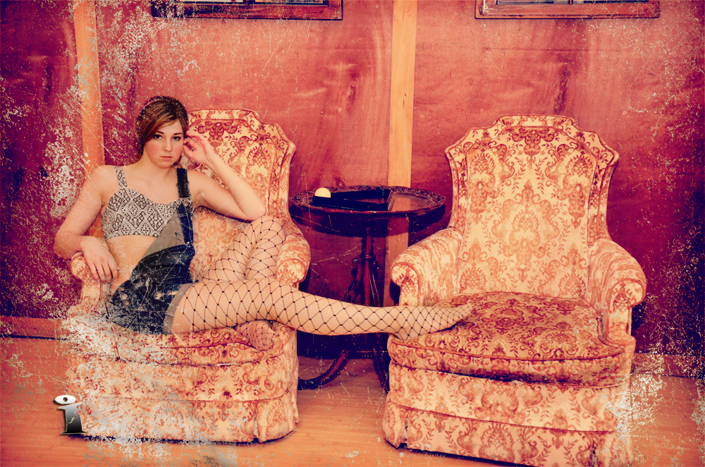 20150606 Sandra R Set 04 Image 01 – Old Pool hall (adj.)
Now it looks more like the underlying paper under the emulsion. This is why you should always work with adjustment layers and masks. Imagine if I had actually just cut and paste the original image… there would be no going back.
09 Tuesday Jun 2015
Posted in Art, being Facebook friendly, photo
This gallery contains 1 photo.
Whoot Whoot this is post #300 of my blog “Adventures with My Camera” So we’re going all multimedia and stuff. …
08 Monday Jun 2015
Posted in Art, being Facebook friendly, photo, photo shoot

This gallery contains 5 photos.
I don’t know if I’ve mentioned it before but the Detroit Erotic Arts Collaborative has changed names it’s now The …
29 Friday May 2015
Posted in Art, being Facebook friendly, photo
Tags
This gallery contains 5 photos.
The render of Ash K has been going for about a week now Ask K Point 002 As part of …
28 Thursday May 2015
Posted in Art, being Facebook friendly, photo
Tags
“OMG i love the close up of the girl in the mask.
lemme know if i can buy a print!”
That’s an actual verbatim quote from the host who allowed me to shoot at their place for my May Shooting window.
Just this week I started putting together a Dropbox folder containing a few previews from the shoots I’ve done at various locations. Mostly to show hosts what I’ve been up to on their property and also as a way to show potential host what I’m looking to do.
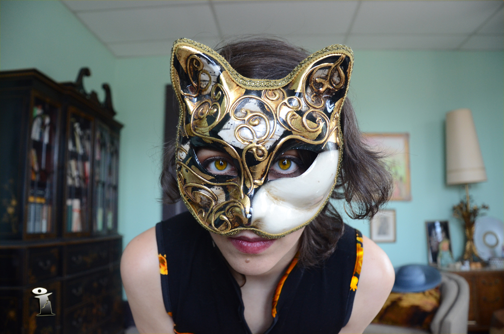 20150520 Wingless F Set 15 Image 06 – Girl in the mask.
The images I have out on Dropbox are just previews all that has been done is auto levels and resized to 1000 pixels on the largest side. Certainly not 100% finished even my best images get a little nudge here and there.
I was looking at way to finish “Girl in the Mask” so I asked for some advice from my wife (a most excellent photographer). She offered that it needs a little more red.
I could see her point the braiding around Wingless F’s top was a red floral design (roses i think). Unfortunately it was the only red in the composition and it looked slightly out of place.
I thought about adding red to the room but the color scheme in the room was awesome and I felt I couldn’t add red to the background without it looking garish. Then I thought, how about I do it backwards and take elements from the room and change the way Wingless F looks instead.
Using the sideboard on the back wall and the throw pillow in the chair as inspiration I changed the floral design from red and white to a more marmalade tabby cat design. I also felt I need to nudge the eye color to help with tying the colors and cat theme together.
I like it. I’ll see what size my May Shooting window host would like and I’ll get it printed and give it to them. After all flattery goes a long way in my book ;0)
27 Wednesday May 2015
Posted in Art, being Facebook friendly, photo
Tags
Aurora was the last appointment of the day. Usually my last appointments can go one of two ways.
It could be my creative bucket is dry – I’ve used all my brain power to come up with poses and angles on the previous appointments. Now I’m just repeating and repeating only the model has changed.
Or
I come up with new poses and I’m kicking my self for not thinking of it sooner.
With Aurora R it was partially both. I hadn’t had lunch and I was flagging when Aurora R arrived at the location. The first sets where warm up as usual when I started shooting in earnest I felt I was repeating and I couldn’t stop myself. Around set 13 I started getting my second wind. By the time I got to set 14 I was kicking myself wondering why I hadn’t done this earlier.
 20150520 Aurora R Set 14 Image 05
This is another channel mixer adjustment. I boosted the green channel thinking I might clip the highlights again and block the view from the window. It was way over the top so I started bringing down the Red channel. I waited till I got the view outside and then I just moved it until I felt the view balanced out and everything had the same tone /’color’. I wanted the view outside to look homogenized and slightly bland so that all the interest was kept within the room.
I wanted the focus to be on the light and shadows on Aurora R.
26 Tuesday May 2015
Posted in Art, being Facebook friendly, info
This gallery contains 1 photo.
Ash K was my first appointment of the day. Starting off earlier in the day the light coming through the …
25 Monday May 2015
Posted in Art, being Facebook friendly, photo
Tags
Near the end of the shoot we decided to try out a posing with a hat that we found at the location. It was a nice color and matched the cardigan that Wingless F wore when she arrived at the shoot.
We managed to do a couple of sets using the hat. We got a number of great images with the hat posing in front of the windows.
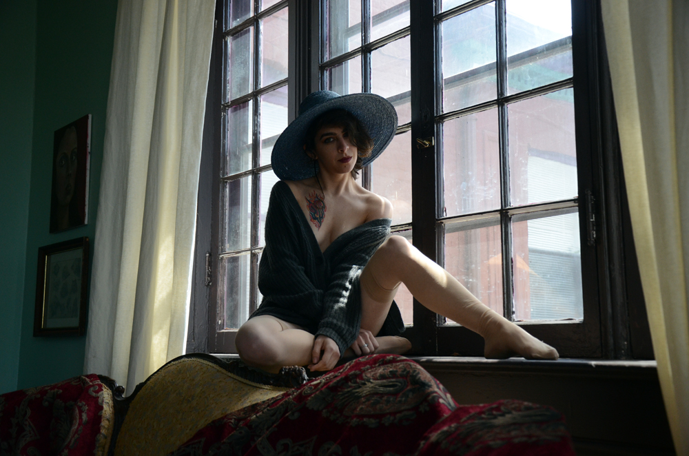 20150520 Wingless F Set 18 Image 09
I like the image and the pose but I don’t like the view through the window. I also feel Wingless F’s face is a little too much in shadow. When I was looking at ways to improve the image I decided to try making it Black and white. I chose the channel mixer method using adjustment levels I mixed the various Red, Green and Blue channels together. While I was working on it I noticed if boosted the Blue channel I could overly brighten the view out the window. As you can see I intentionally clip the highlights to the point when I would loose the details outside the window.
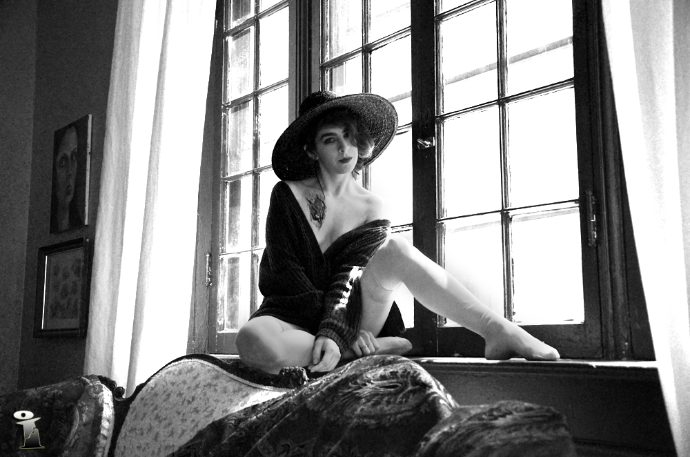 20150520 Wingless F Set 18 Image 09 – Black & White
It also meant that I would be clipping details from other already bright areas like the curtain on the left (which I didn’t mind) and Wingless F’s left leg which I did mind. So using the brush tool I removed part of the adjustment layer over the details that where being clipped. I included a saturation layer (-100) to make sure everything stayed without color.
You probably don’t notice but the corner of the room on the left is a little grainy. It was brightened a little too much. I was thinking of fixing it but I think I like it. It gives me the impression that it’s film grain and that the image was “printed” from a negative.
23 Saturday May 2015
Posted in Art, being Facebook friendly
Tags
This gallery contains 3 photos.
Well it’s more like an allotment or a window box than a farm. I now have more than one computer …
